" height="23px" id="FbLC6MgbO" transform="translate(0.5 4)" width="31.000000901383913px"/></svg>)
Year
2025
Industry
Typography
Space of work
Custom Typeface

Introduction
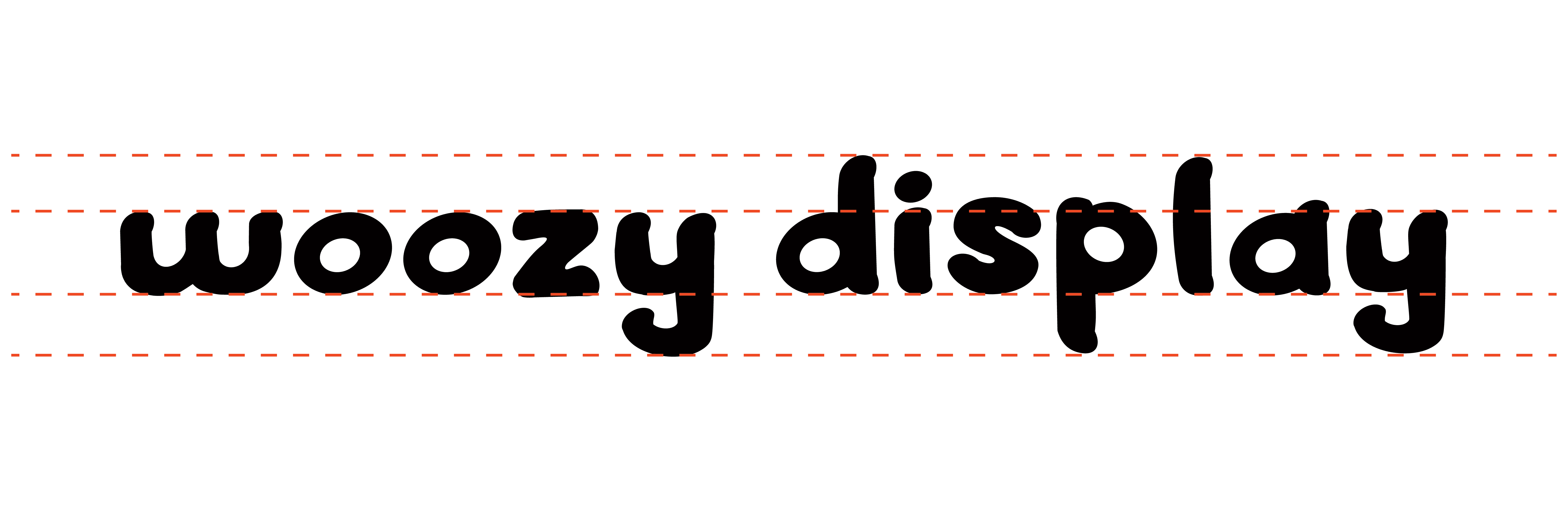
Woozy Display Typeface
Woozy Display is a soft sans serif display typeface. Because it features an extra bold weight and big rounded terminals it is intended to be used exclusively for headings and titles. It’s greatest strengths are the visual attraction born from it’s heavy presence, and the approachability of it's softly rounded terminals.
Objective
Creating an original typeface
This typeface was designed by searching for household items that can be used as construction elements. What emerged was a typeface that is as soft and flexible as the elements that constructed it -- a shoelace, pillow, and pushpins.


Audience
Children and Families
This typeface is best leveraged in casual environments. Because of the type's soft shapes it pairs strongly with anything involving children -- books, restaurants, amusement parks. The heavy weight gives the type extreme legibility, perfect for children learning to read, and attracting customers to a business or event.

Process

(03)
PROJECTS


