" height="23px" id="FbLC6MgbO" transform="translate(0.5 4)" width="31.000000901383913px"/></svg>)
Year
2025
Industry
Consumer
Space of work
Brand Identity

Introduction
Reinforcing + Reidentifying L.L. Bean
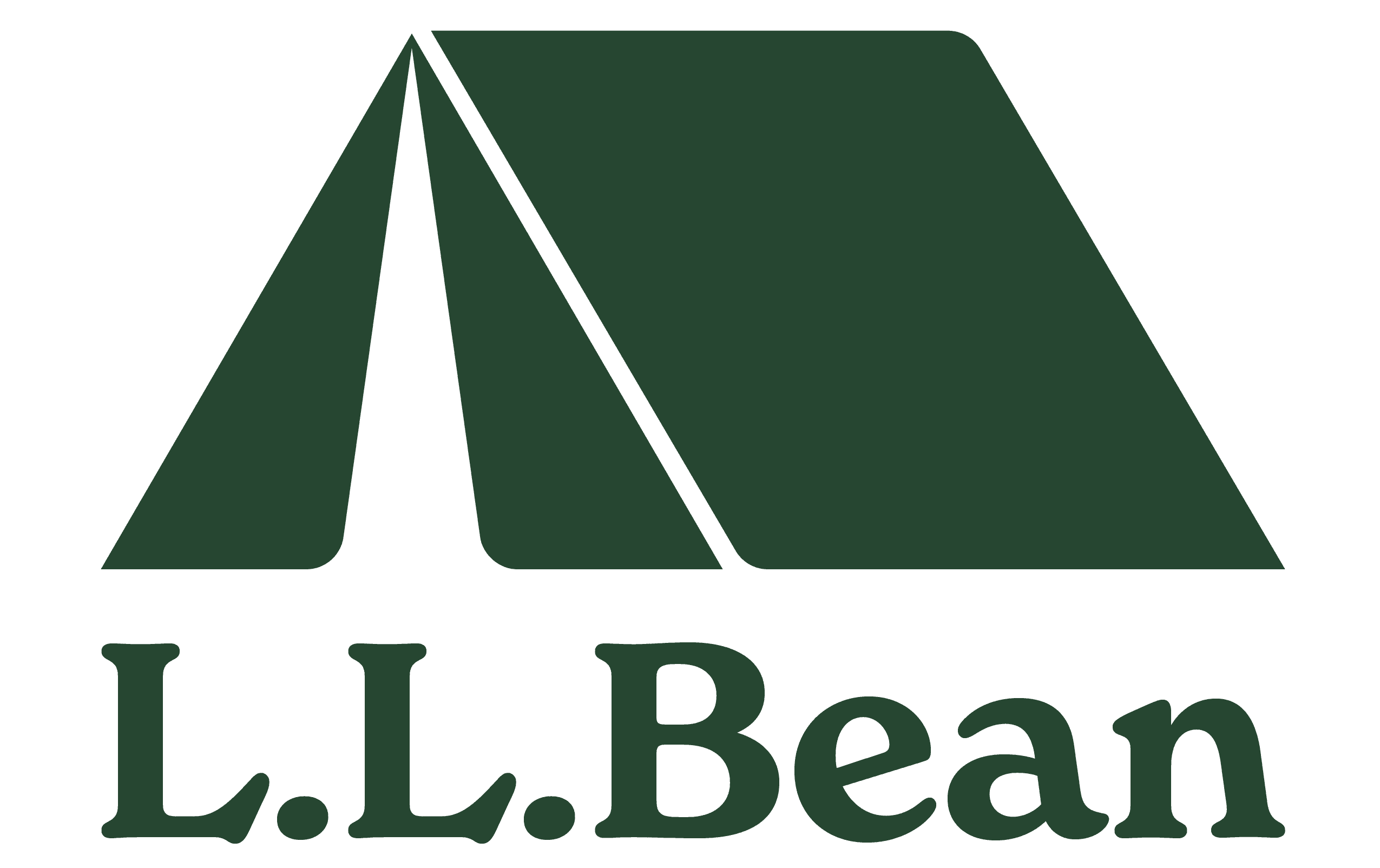
This project was to identify and create a more visually appealing and recognizable mark for L.L. Bean. L.L. Bean is an American reatail company founded and headquartered in Freeport Maine. L.L. Bean is a family owned business, and has a strong identity around families being together in the outdoors. As a company that was founded 114 years ago, L.L. Bean has had different logos and identities -- primarily around the wordmark L.L. Bean, which first appeared in 1950. Besides just the wordmark, there was also the 1987 “sunrise over katahdin” logo, a multi colored, highly detailed graphic which included the wordmark. Since 2010, L.L. Bean has gone back to the simple wordmark -- though minimal and clear, this mark lacks personality. An image speaks a thousand words. The new mark includes a tent, which is the primarly shelter for familes in the outdoors. It is the literal place where families come together when spending time in nature. The style of the mark features crisp geometric edges, maintaining the strength and reputation of a hundred-year-old brand legacy, paired with clean runded ends that marry well to the typeface, creating contuinuity from the existing logo.
Objective
Create a Memorable Mark to Complement the Existing Brand
The new logo is an expansion on L.L. Bean’s existing values -- primarily around bringing family together in the outdoors. The old logo (below) is strong, but lacks visual appeal and a unique mark. Our new mark is the visual intersection of Shelter and Connection. A symbol that no matter how far you go into the wild, you are always home when you are with your people. It is a modern icon for a timeless truth: we go outdoors to find each other.


Audience
Parents and their kids: Nostalgia Summer Camp
Warmth, family, and 80's Nostalgia. Using a secondary palette, bold soap typeface, and the sticker texture, the “10 Essentials” graphic proves that the primary identity is strong enough to anchor even our most playful campaign expressions. This campaign emulates the nostalgia of a 1980s summer camp, showing today's kids their parent's childhood aesthetics.


Process

Style Guide


(03)
PROJECTS


